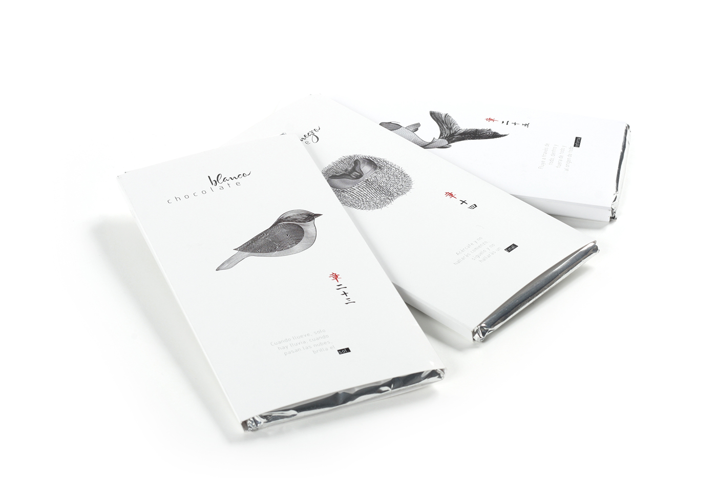
Dou Tse. Branding and packaging design for a fictional chocolates brand.
The illustrations are inspired on the optical illusions known as Moire pattern, which are produced using the card of the back of the container with horizontal movements above the illustrations. Each illustration has its own pattern, getting in this way different optical illusions on each illustration.
Each chocolate has a chinese Haiku Poem based on the book “Tao Te Ching” about the philosophy of nature and the world view.
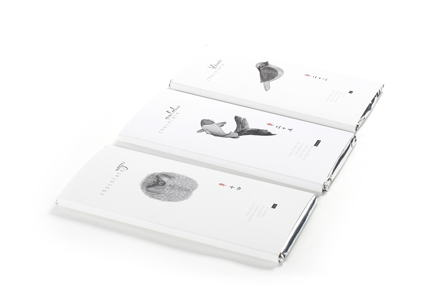